

How to Style Vibrant Floral Bedding: 7 Easy Steps
Table of Contents
- How to Style Vibrant Floral Bedding: 7 Steps
- What You'll Need Before You Start
- Step 1: Choose the Right Floral Print and Pattern Scale
- Step 2: What Colors Go With Floral Bedding
- Step 3: Pair Patterned Bedding With Solid Sheets
- Step 4: Mixing Patterns With Floral Bedding Without the Busy Look
- Step 5: Layer Quilts, Throws, and Blankets for Depth
- Red Green Tartan Plaid Cotton Comforter | Classic Scottish Check Bedding
- Step 6: How to Decorate a Bedroom Around Floral Bedding
- Step 7: Add Throw Pillows and Shams to Finish the Look
- Styling Your Floral Bed: What Matters Most
- Frequently Asked Questions
Last Updated: October 5, 2026
How to Style Vibrant Floral Bedding: 7 Steps
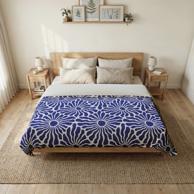
Vibrant floral bedding is one of the fastest ways to wake up a plain bedroom, but most people get the styling wrong. They pile on pattern after pattern until the bed looks chaotic instead of curated. At LOLA VEGAS ART, we offer original floral prints for bedding and home textiles.

The fix is simpler than you'd think: pick one floral print, pull your colors from it, and let solid layers do the quiet work around it. Below, we'll show you exactly how to style vibrant floral bedding in seven steps, from choosing the right print scale to finishing with shams and throw pillows. The steps take an afternoon, not a weekend.
interiors and color guidance from Houzz
What You'll Need Before You Start
Gather these basics first so you're not hunting for pieces mid-styling:
- Your floral duvet cover or comforter as the anchor piece
- One set of solid sheets (white or a pulled color)
- A quilt, throw blanket, or knitted blanket for layering
- Two to four throw pillows and one or two shams
- A tape measure and your room's lighting in mind
Total time: about 1 to 2 hours.

Step 1: Choose the Right Floral Print and Pattern Scale
Start with the print itself, because everything else follows from it. A large-scale floral reads as a statement and works best in a room with space to breathe. A small, dense print feels calmer and suits smaller bedrooms.
A common mistake is buying a print that's too busy for the room. If your bedroom is small or packed with furniture, a medium or small floral keeps things from feeling crowded.
Also check the print's color count. Prints with three or four colors are easier to coordinate than ones with eight. Fewer colors mean fewer decisions later.
Step 2: What Colors Go With Floral Bedding
The easiest answer: pull colors straight from the print. Every floral already contains a ready-made palette, so you never have to guess. The trick is knowing which colors to pull and where to put them.
Pull Colors Straight From the Print
Look at your floral and name its main hues out loud. Then match your sheets, throws, and pillows to those exact tones. This guarantees a cohesive look because the colors already live together in the design.
A more precise method is to sort the print's colors into three roles:
- Dominant hue: the color that covers the most area (often the background or the largest blooms). Use this for the largest solid surface, like a quilt or a wall.
- Secondary hue: the second-most visible color. Use this for sheets or a throw.
- Accent hue: the smallest pop of color (a bud, a leaf vein, a center). Use this for pillows, piping, or a small vase on the nightstand.
This hierarchy keeps the room from feeling flat because each color has a job.
Warm, Cool, and Multicolor Palettes
Different floral palettes need different supporting colors:
- Warm florals (reds, oranges, yellows, warm pinks): pair with cream, warm white, camel, or terracotta solids. Avoid cool grays, which can make warm prints look muddy.
- Cool florals (blues, greens, purples, cool pinks): pair with crisp white, soft gray, sage, or navy solids. Warm beige can clash with cool blues.
- Multicolor florals (three or more competing hues): choose one hue as the anchor and keep every other solid neutral. If the print has pink, green, and yellow, pick green for the sheets and keep the rest white or cream.
Complementary Hues vs Neutral Tones
You have two solid paths here:
- Complementary hues: pick a color opposite your floral's dominant shade on the color wheel for a bolder, energetic room. For example, a pink-dominant floral pairs with a soft green throw.
- Neutral tones: use white, cream, or soft gray to let the floral be the only star.
Neither is "correct." Complementary hues suit maximalist style. Neutral tones suit a calm bedroom. Pick based on the mood you want.
color theory basics from Color Matters
Step 3: Pair Patterned Bedding With Solid Sheets
Solid sheets are the secret to keeping a bold floral from overwhelming the bed. Patterned bedding plus patterned sheets equals visual noise.
White sheets are the safest pick. They act like a blank canvas and make the floral pop. If you want more warmth, choose a solid sheet in one of the floral's secondary colors.
color theory basics from Color Matters
The rule is simple: one pattern on the bed, everything under it solid. This single choice does more for a cohesive look than any other step.
Step 4: Mixing Patterns With Floral Bedding Without the Busy Look
Mixing patterns with floral bedding works when you follow the scale rule. Pair a large floral with a small, quiet pattern like thin stripes or a tiny dot. Never mix two large, loud prints.
A simple framework makes this repeatable. Think of every pattern on the bed as belonging to one of three tiers:
- Tier 1, Hero: the floral duvet or comforter. Largest scale, most colors, highest contrast.
- Tier 2, Support: one secondary pattern at roughly half the scale of the hero. Thin stripes, small checks, or a tiny geometric.
- Tier 3, Calm: solids only. Sheets, a quilt, or a throw that give the eye a rest.
The rule: never place two patterns from the same tier next to each other. A large floral plus large stripes fights. A large floral plus thin stripes works because the scales are different.
Here's the framework we use:
Layer |
Pattern Rule |
Example |
|---|---|---|
Floral duvet |
Tier 1, large, bold print |
Tropical floral |
Sheets |
Tier 3, solid only |
White cotton |
Accent throw |
Tier 2, small-scale pattern |
Thin stripes or small checks |
Pillows |
Tier 3 or tiny Tier 2 motif |
Cream, soft pink, or a mini dot |
Keep the floral as the loudest voice. Every other pattern should be quieter than it. That's what creates visual balance instead of chaos.
Matching Pattern to Pattern Type
Not all secondary patterns behave the same way:
- Stripes: the safest partner for florals. Thin, low-contrast stripes read as texture rather than pattern.
- Checks and gingham: work well when the check is small and uses one color from the floral plus white.
- Dots and small geometrics: best when the dot is tiny and the color is pulled from the floral's accent hue.
- Second floral: possible only if the second floral is much smaller and shares at least one color with the hero. Two large florals almost never work.
Step 5: Layer Quilts, Throws, and Blankets for Depth
Layering is what turns a flat bed into a cozy sleep space. Fold a quilt at the foot of the bed and drape a knitted blanket or throw blanket over one corner. This adds depth and texture without adding more color.
Red Green Tartan Plaid Cotton Comforter | Classic Scottish Check Bedding
Choose throws in a solid tone pulled from the floral. A soft pastel or a deep neutral both work. Linen and cotton keep it light for spring and summer; a knitted blanket adds warmth for winter.
Step 6: How to Decorate a Bedroom Around Floral Bedding
Once the bed is styled, the rest of the room needs to support it, not compete. This is where floral bedding bedroom ideas often go wrong: people match the walls to the print and the room turns flat.
Room Size, Lighting, and Seasonal Styling
Small rooms benefit from lighter, brighter surroundings so the floral doesn't feel heavy. Large rooms can handle deeper wall colors pulled from the print.
Lighting matters too. Warm bulbs soften bold colors; cool light makes them look sharper. Test your bedding under your actual bulbs.
For seasonal styling, swap the throw and shams rather than the whole set. A lighter quilt in spring and a knitted blanket in winter refreshes the look for less.
seasonal home styling tips from Real Simple
Step 7: Add Throw Pillows and Shams to Finish the Look
Throw pillows and shams are the finishing touch that makes a bed look styled rather than made. Use shams behind your sleeping pillows to frame the floral, then layer accent pillows in front.
Stick to an odd number of accent pillows, usually three or five. Mix sizes: two large, two medium, one small. Keep colors pulled from the floral so the palette stays tight.
A common mistake is too many pillows. If you can't sit down without moving five pillows, you've overdone it.
Styling Your Floral Bed: What Matters Most
The challenge with bold bedding isn't the print itself, it's restraint. Too many patterns, too many colors, and the bed loses its calm. Keep one floral as the anchor, pull your colors straight from it, and let solid layers do the quiet work.
At LOLA VEGAS ART, our original floral designs are made to be the centerpiece of a room. Our Tropical Floral Microfiber Duvet Cover brings a burst of pink and green into any sleep space, with a soft microfiber feel and an invisible zipper for a clean finish. Pair it with our Blue Radiant Floral Cotton Duvet Cover or layer in a Vibrant Floral Comforter for extra warmth. Shop LOLA VEGAS ART and build a bedroom that reflects your own style.
Frequently Asked Questions
What colors go well with vibrant floral bedding?
Pull colors directly from the floral print itself. If your duvet cover has pink and green florals, use those same hues in solid sheets, throw pillows, or a quilt. White or cream sheets also work as a neutral base that lets the floral bedding stand out. For a bolder look, try complementary hues like soft pastels against deeper tones. The goal is a cohesive bedroom palette, not a clash of random colors.
How can you mix patterns with floral bedding without making the room feel busy?
Keep one pattern as the star and choose supporting patterns in a smaller scale. A large floral duvet cover pairs well with thin stripes on sheets or a small geometric print on accent pillows. Stick to two or three patterns maximum, and make sure they share at least one color. Using solid sheets and a neutral quilt between patterned pieces gives the eye a place to rest.
How do you make floral bedding look luxurious?
Layering is the fastest route to a luxurious look. Start with a floral duvet cover or comforter as your base, add crisp solid sheets, fold a quilt or throw blanket at the foot of the bed, and finish with shams and accent pillows. Mixing textures like cotton, linen, and microfiber adds visual richness. Keeping the surrounding bedroom decor calm and uncluttered lets the floral print feel intentional rather than overwhelming.
Are floral bedding patterns still in style in 2026?
Yes. Floral bedding remains a strong choice, especially with the rise of maximalist style, boho decor, and vintage-inspired bedrooms. Bold botanicals and vibrant florals are particularly popular for spring bedroom refreshes. The key is styling them with intention: balance the print with solid sheets, neutral tones, or complementary hues so the room feels cohesive rather than dated. Floral print bedding works across romantic, bohemian, and modern bedroom palettes.